Alma Ata Mobile

Thumbnail Alma Ata

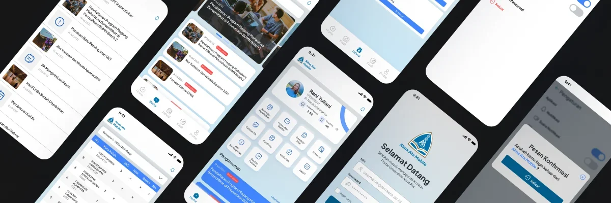
Alma Ata Mobile is a user-friendly mobile application that simplifies students' academic and administrative tasks, making it easy to manage everything from one platform.

Overview

Alma Ata Mobile is a mobile app designed specifically for academic and administrative activities at Alma Ata University.

Focused on functionality, this app aims to be user-friendly and efficient, making it easier for students to access all their academic and administrative needs in one place.

Details
Time Frame:

2021 (Updated 2022)

Role:

Solo UI/UX Designer

Involvement:

Mobile App Design, Prototyping

Problem

Currently, students at Alma Ata University need easier and faster access to academic information, all from their gadgets, so they can access it anytime and anywhere.

Goals

Alma Ata Mobile focuses on a user-centered design to make it easier for students to access all academic information, while maintaining high usability with a simple, clean, and refreshing visual design.

User Audience

Active students of Alma Ata University.

Scope & Constraints

Designing the mobile app interface for Alma Ata University’s academic application based on the provided brief, which includes:

User Research

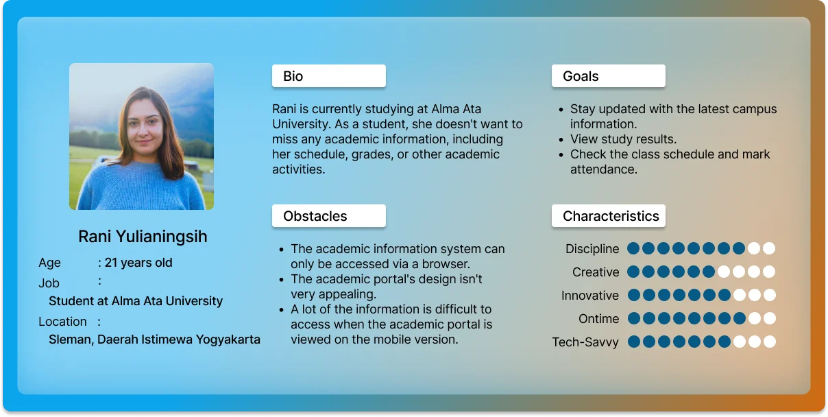
The users are students at Alma Ata University, primarily millennials aged between 17 and 25 years. From this, I created a user persona to help outline the solution more effectively.

User Journey Map

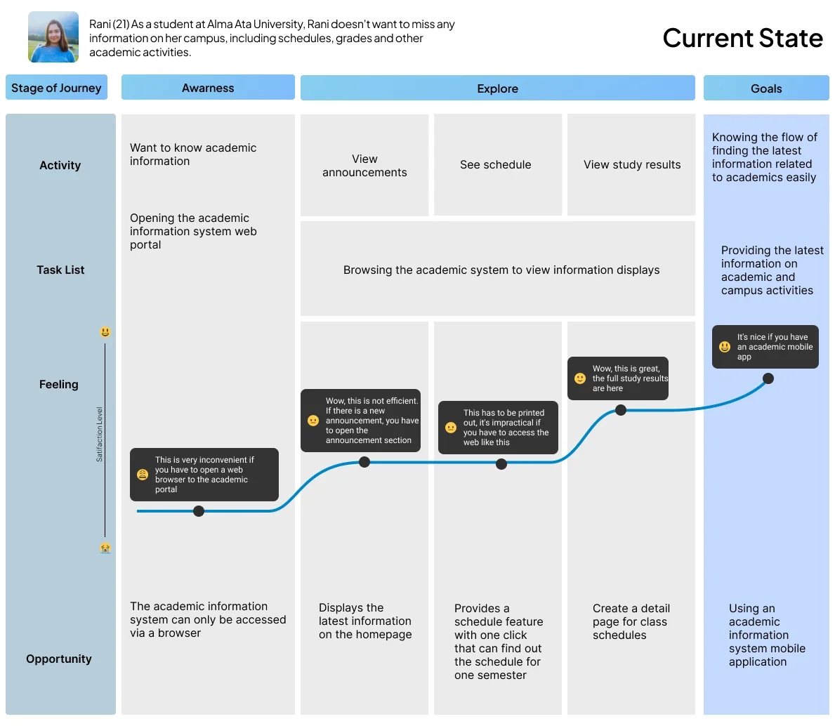
I use the user journey map to outline the flow and understand what the user does at each step. The journey map reflects the current state, which is the condition before the product was developed.

After researching user problems, the main issue to address is:

"How Might We design an informative application that ensures users feel comfortable when accessing academic information?"

Sketch

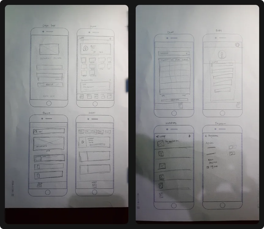
After finalizing the concept, I began gathering references and sketching. In this process, I prefer using paper as it allows me to freely express and explore ideas.

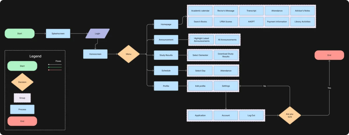
User Flow

User flow helps map out the detailed path users take to achieve their goals within the product we design.

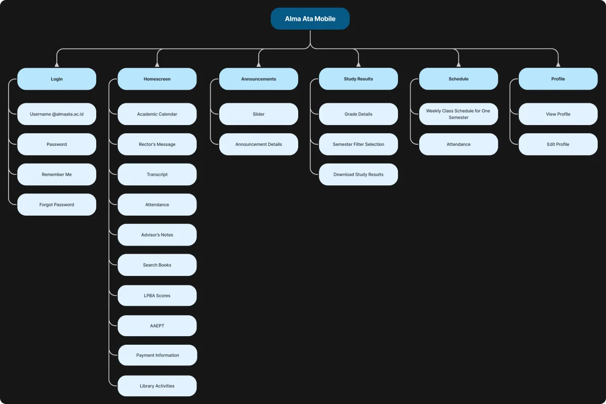
Sitemap

The sitemap is kept simple. I use it to visualize the scope of the project and to guide the design of all the pages. This approach helps save time during the design process.

Wireframe

After completing the sketching process, the next step is to create a wireframe. This helps define the actual dimensions before moving on to the High Fidelity stage. At this stage, I also include a wireflow to map out the prototype flow that will be developed.

Design System

I created a design system to speed up the design process and ensure consistency in design components, both in terms of size and color.

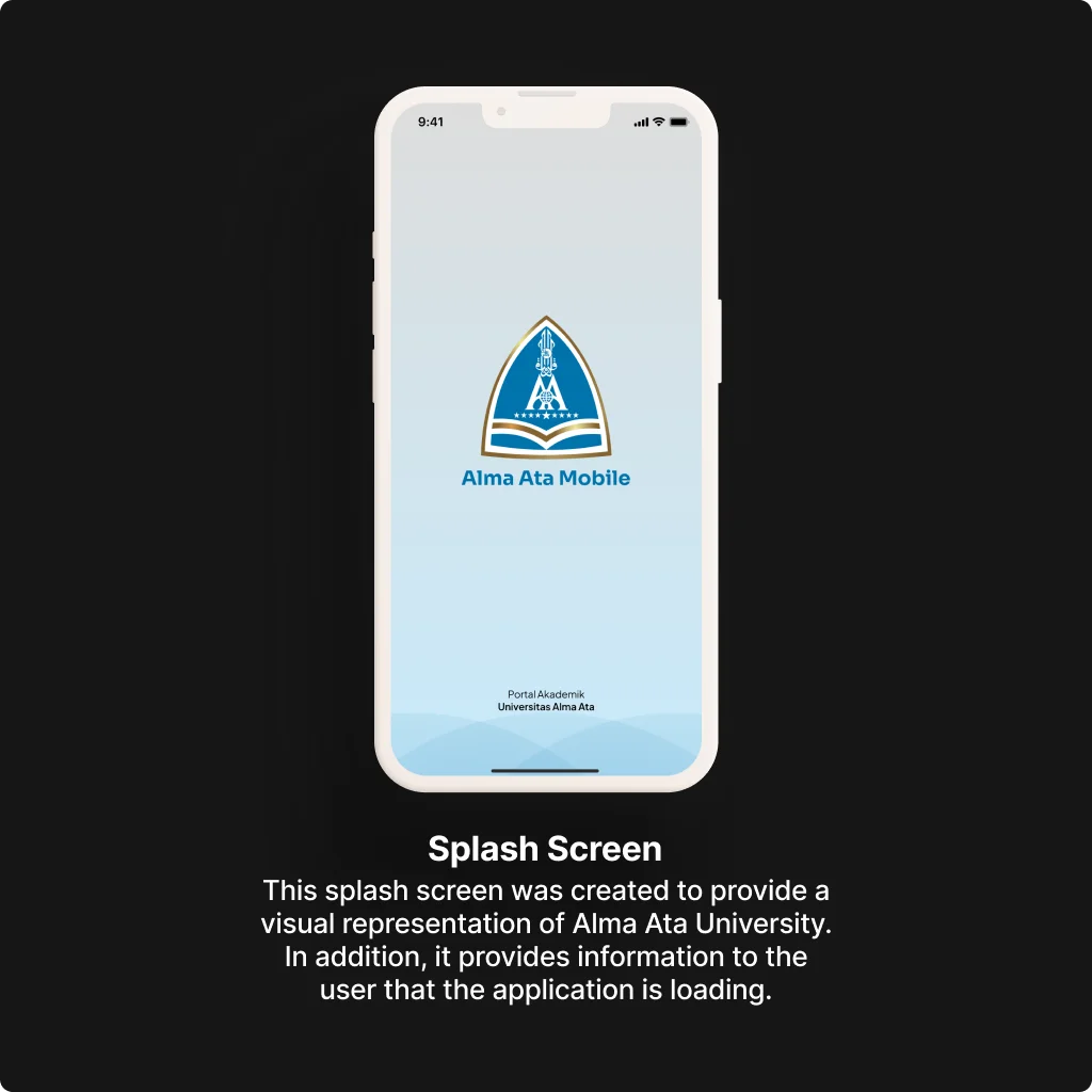
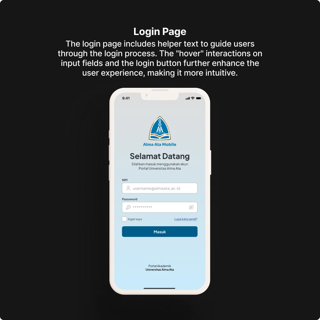
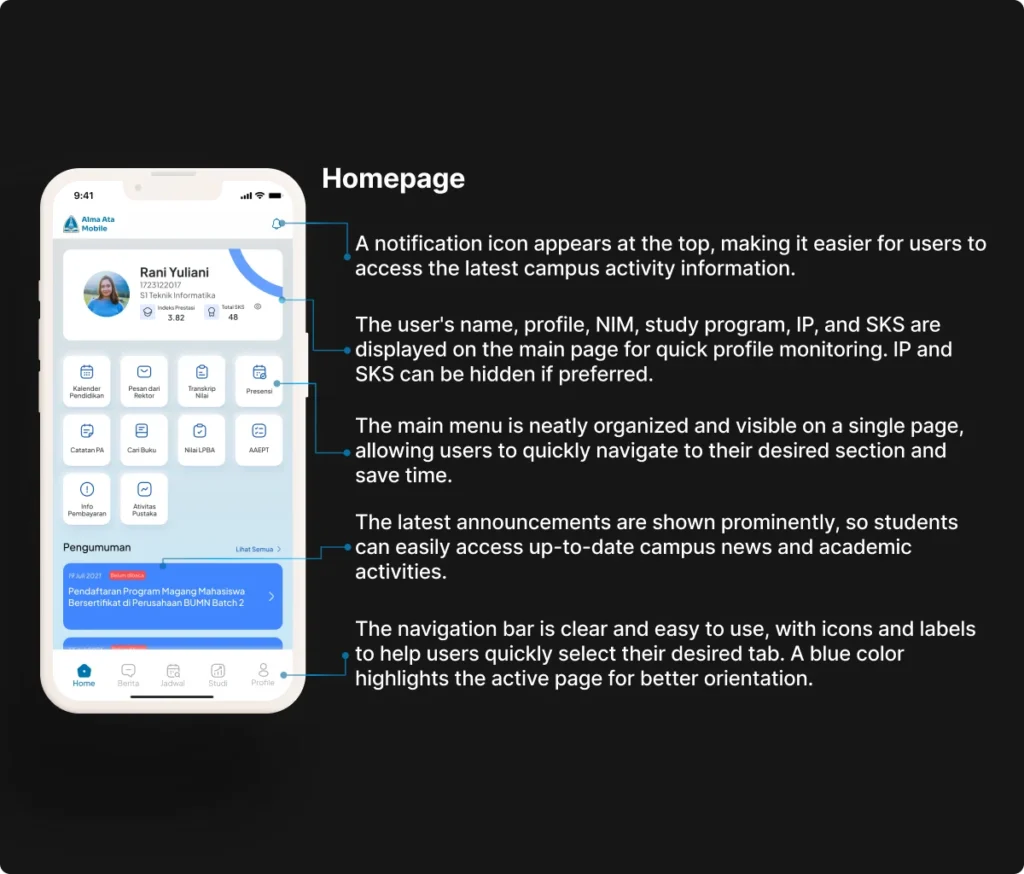
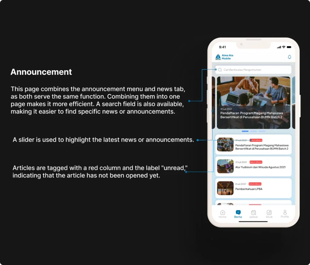
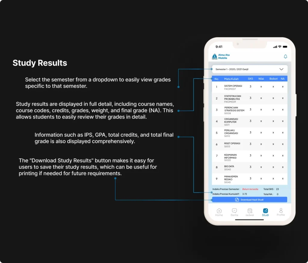
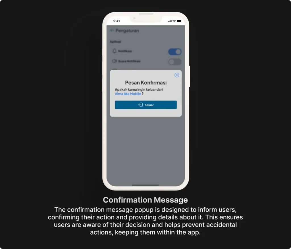
High Fidelity Design

Prototype

Check out the interactive prototype! Click through the screens to experience the flow. This prototype shows how the design works, how elements interact, and gives you a preview of the final product before development starts.

Takeaways - Lesson Learned

This design process has been enjoyable. The result is an improvement from the previous design and aligns with the given brief. Additionally, I learned that during the design process, there will be improvisations or additions to components aimed at improving aesthetics, which must still maintain the functionality of those changes.

At the prototyping stage, I also realized that presenting interactions, even the smallest ones, can significantly impact usability testing and the development phase.

I hope this design challenge serves as a useful reference for others.

Have a project or collaboration in mind? Let’s work together.